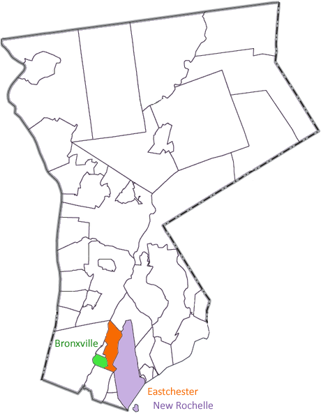
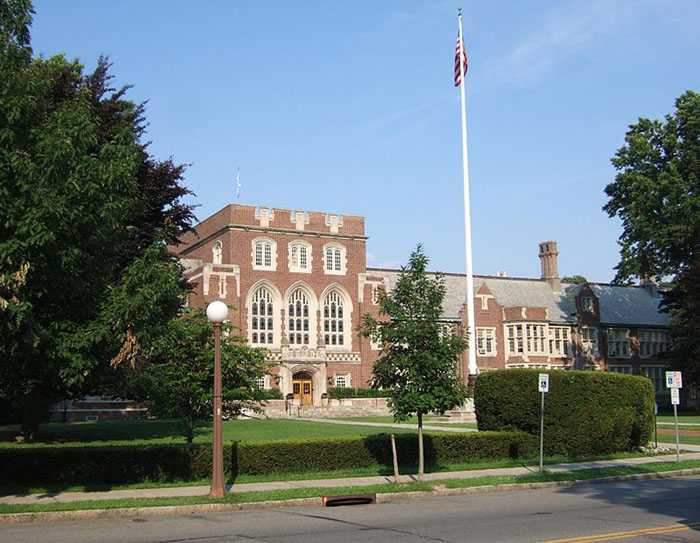
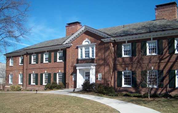

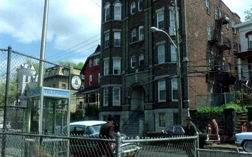
This scene shows Abagnale’s youth in New Rochelle, New York. In real life, Abagnale grew up in Bronxville, another suburb of New York City in the south of Westchester County. The Kennedys resided in Bronxville.) Not that it matters: they’re both “expensive ZIP codes” — think affluent villages with magnificent houses in a residential, country-like environment.


Strangely, in the interviews Abagnale gave when the movie got released, he described the divorce as “trigger” for his extraordinary behavior a novelty of the screenplay, saying that “Catch Me If You Can” had “become a movie about the effects of divorce”. The key word here is “become”!
(The divorce angle resonates with Steven Spielberg’s personal life; his puberty was deeply traumatized by his parents’ divorce. Think of the divorced mother in “E.T.”, for instance… I won’t discuss this issue further: it’s not the subject of this web site by any stretch and a detailed analysis has been written by others — though never better than by the Spielberg biographer Joseph McBride!)
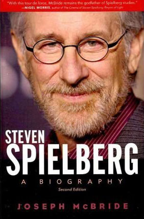
Joseph McBride
“Steven Spielberg: A Biography”
Faber and Faber, 2012
ISBN 0571283101
Still, here’s what Abagnale tells us in Laurent Bouzereau’s bonus material: he ran out of the family court, went to New York by train, didn’t see his mother for 8 years and never saw his dad again… (bonus DVD — Frank Abagnale: Between Reality and Fiction — Meet Frank Abagnale, 03:44-04:21) And that’s what you see in the movie! The only difference is that he learns of the impending divorce not from a judge but from an attorney at the appartment. A dead simple change in the screenplay to compress events, avoid extra characters and locations etc.
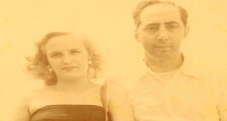
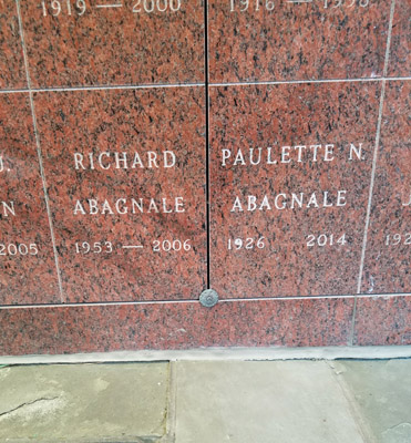
(For the same reasons, the movie presents Abagnale as an only child; in real life, he had three siblings. His younger brother Richard passed away; his sister Linda and his older brother Jean-Paul, a 6 foot 4 inches U.S. Marine who played semi-pro football for Buffalo, are retired. His mother Paulette (named Paula in the movie), who poses in the photo with his father, continued to live in the New York area until her death in 2014.)
Now, I’m no psychiater but how can you deny the link when the appearance before the judge that forced him to make a choice — did he want to live with his mother or father? — had such dramatic effect? Sure, Abagnale is no longer the misguided kid he was then, but in this case, the facts speak for themselves. Let’s just conclude that we’re not always the best judge of own behavior. Not everybody is filmmaker Oliver Stone, who in his autobiography “Chasing the Light” (Houghton Mifflin Harcourt, 2020), faces the break-up of his ill-suited parents during his teenage years head on. Chapter 1 is called “Child of Divorce”, for instance. (His story is quite similar to Abagnale’s: Louis Stone, a Colonel on General Eisenhower’s staff, met a girl from Southern France when the Allied Forces liberated Paris…)
In his latest book, Abagnale has come to terms with his parents’ divorce as trigger for his criminal career — though not entirely. “My parents had split up when I was [sixteen], and it shattered me. The confusion and anger caused by the breakdown of their relationship was one of the events that propelled me down the wrong path.” (book “Scam Me If You Can”, page 249). Just one of the events? His book(s) offer(s) no other reason or contributing factor, let me tell you!
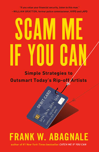
Frank W. Abagnale
“Scam Me If You Can”
Simple Strategies to Outsmart Today’s Ripoff Artists
Portfolio, 2019
ISBN 0525538968
Spielberg’s composer John Williams certainly didn’t pussyfoot: he had no qualms calling track 13 of his soundtrack “A Broken Home”!
After the divorce, Abagnale remains in the appartment in the neighboring community of Eastchester with his father. The municipality is never discussed, but you can easily infer it from the address on the personal checks he receives as a birthday present from his father and from the letters he sends his father... (Google Maps tells me there is no Hollister Road in Eastchester, only in Teterboro and Lincoln Park, New Jersey…)
Scene 13 — 1:16:53
Scene 6 shows Abagnale’s father as a businessman that fell on hard times.
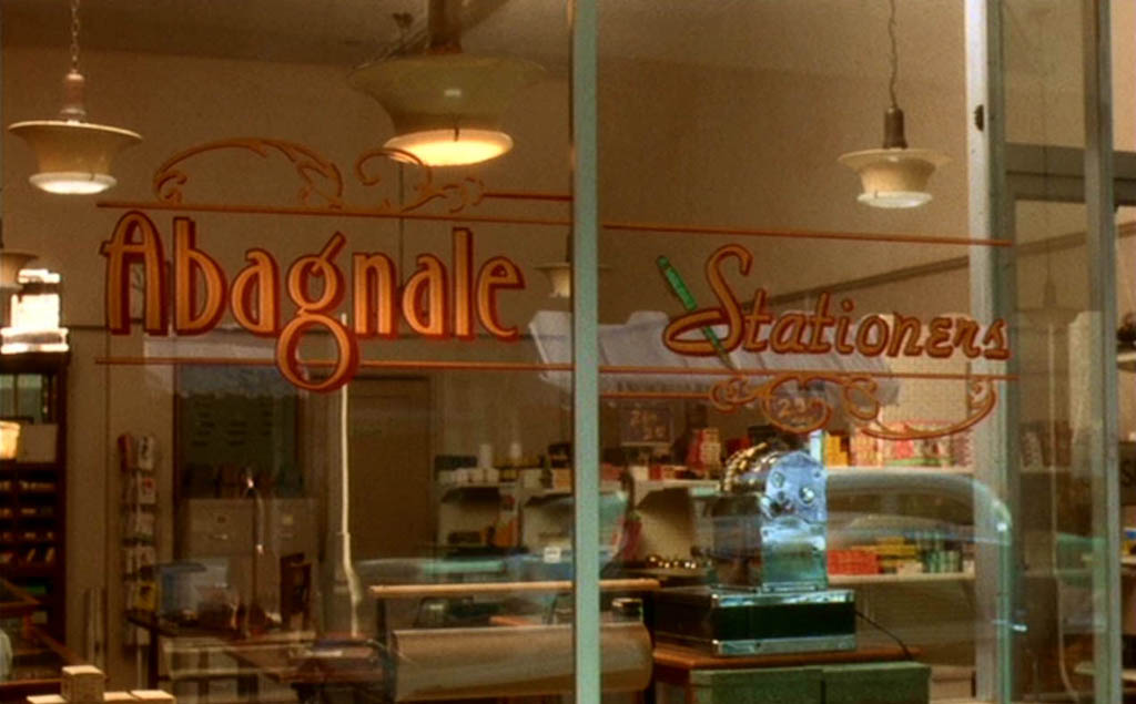
Frank Abagnale Sr. did own a stationery store before Abagnale left home (at 16) and became a fraudster. His father lost everything when Frank Jr. was 14 years old. And he did become a postal clerk as you see in the movie!
Abagnale comments: “Dad opened his own business in New York City after his discharge from the army, a stationery store at Fortieth and Madison Avenue called Gramercy’s. He was very successful.” (book “Catch Me If You Can”, page 12)
(When his father is honored by Jack Barnes, the president of the Rotary Club of New Rochelle, he’s called “the man that keeps our pencils sharp and our pens in ink” (scene 2, 8:52).)
Scene 6 — 31:26
[...] he ran into some severe financial difficulties and lost his business. He was really wiped out. He was forced to sell the house and his two big Cadillacs and everything else he had of material value. In the space of a few months, Dad went from living like a millionaire to living like a postal clerk. (book “Catch Me If You Can”, page 21)
Still, Abagnale did learn some important lessons about paper stock and ink types in this way. He would not have become the succesful check forger he was without this experience! (Because of time constraints, the movie doesn’t make that point: a scene that shows Frank working in his dad’s stationery shop, recommending an advanced product to a customer, didn’t get shot or ended up on the floor of the editing room. You can find it in the published screenplay on page 36.)
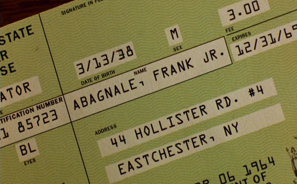
In this scene, the OCR-A font is visible on an (altered) check for the first time.
(Strictly speaking, it’s an anachronism to be using the typeface that early in the movie (in June 1964!) as the first version of OCR-A got developed no sooner than 1968… But don’t lean on the prop master: introducing the font towards the very end of the movie — the historical truth — would have been utterly strange and its quirky but endlessly fascinating character shapes are just too beautiful to discard on a technicality!)
Scene 6 — 29:14
Let me rather explain the font name: the “OCR” bit stands for “Optical Character Recognition”. “A” is the first letter in the alphabet; this tells you that OCR-A was the first font custom-developed for OCR purposes. (OCR-B was the second!)
Optical Character Recognition is very different from magnetic reading! The image scanner (or check reader) captures an image of a paper document (or check) — we speak of “scanning”. At this point, the scanned image is no more than a meaningless cloud of intense points on a lighter background. The OCR software “extracts” the text from that image: it recognizes the shapes and assigns characters. Hence, paper documents are converted into computer data without retyping!
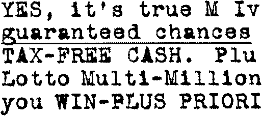
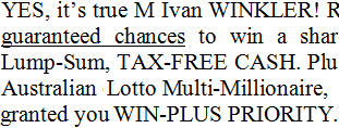
(To learn all about OCR technology, visit the sister web site “How OCR Works – A Close Look at Optical Character Recognition”.)
Unlike OCR-B, which looks more natural, its features were exaggerated to improve the recognition rate. Compare the digit ‘8’ with the uppercase letter “B”, for instance. Clearly distinct! Or compare the numeral ‘0’ with the “O”, the ‘1’ with the “l”, the ‘9’ with the “q”. Not much chance of confusing these similar characters, right?


Remember that this font was designed to be read optically by the first, primitive OCR systems! Bad scans where the image is for instance too dark or too light, smudges on the document etc. can degrade the image quality greatly, and yet misreads have to be avoided as much as possible.
As you can see, OCR-A (and OCR-B), unlike E13B, which you’ll only find on the codelines of checks, are available as general-purpose fonts with a full character set.
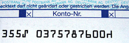
Because of its unusual, “digital” look, the typeface is sometimes used in magazines and advertising. More importantly, OCR-A for some funny reason always gets used in science-fiction movies — you’ll see it in, say, the lettering on the side of a spaceship —, in technological contexts on TV and the likes…
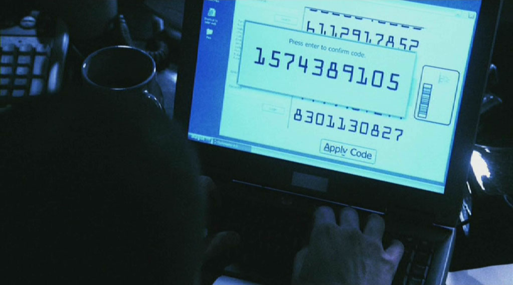
(And then a full alphabetic version of the E13B font was developed anyway, but I doubt you’ve seen it in other contexts than to evoke computerization.

It’s indeed called
Data 70!
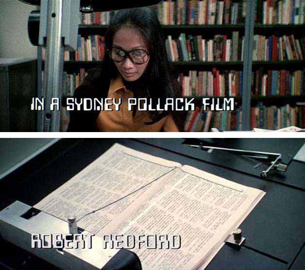
Sidney Pollack
used it in the
title sequence
of his
espionage thriller
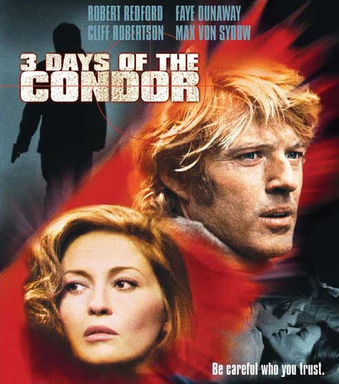
“Three Days of the Condor”
(1975). Names animate on-screen in the
high-tech typeface to emulate the movement
of a book-reading scanner that
C.I.A.
operative
Robert Redford
uses at the office.)
IMDB page on Three Days of the Condor
—
Wikipedia page on Three Days of the Condor
When used in banking applications, the OCR-A character set contains some special symbols: the long vertical mark, the chair, the fork and the hook.
| Special Symbols OCR-A | ||
 | ||
| long vertical mark |
4 free control characters to send instructions to the scanner
(for instance to indicate the end of the codeline) the long vertical mark is often used as field separator |
|
| hook | ||
| fork | ||
| chair | ||
OK, those were the goodies on the OCR-A font. Here’s a sidetrack that I can’t resist: in Europe, the OCR-B typeface played the role that OCR-A (and E13B) played in the U.S.

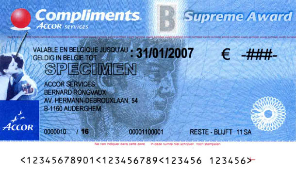
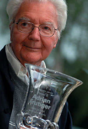
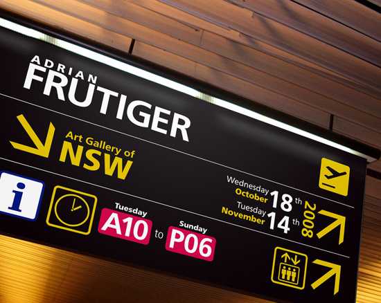
This font is not in the movie, so I won’t take this too far, but I want to mention it because the Swiss-French typographer, nay, typeface genius Adrian Frutiger developed it! He also designed the signage for the French airport Charles de Gaulle outside Paris; that font is called Frutiger. It’s timeless and still unsurpassed for signage applications…
Now, on to the other Spielberg movie where
typefaces play a significant role —his
comedy
“The Terminal” (2004).
Well, is that the Frutiger font we see
on the
signage
in the airport terminal?
IMDB page on The Terminal
—
Wikipedia page on The Terminal
It is! I’m positive. The production designer Alex McDowell built a temporary terminal from scratch in an abandoned hangar. For the signage, he asked the Dutch sign designer Paul Mijksenaar to put in his new, efficient “wayfinding system” as it’s in use at the New York airports JFK, LaGuardia and Newark, and Amsterdam’s airport Schiphol. (bonus DVD — Waiting for the Flight: Building the Terminal, 7:55-8:50)

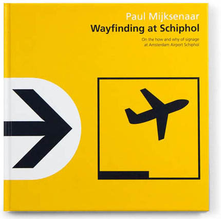
Mijksenaar chose the font he used in Amsterdam and New York, and that font is… Frutiger as it was designed for the Charles de Gaulle airport. Here’s what Paul Mijksenaar has to say about font choices in an interview published in the design magazine “Prodesign” (issue 100) (that you can download from his web site)…
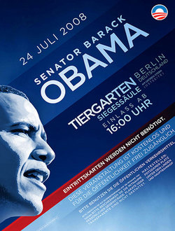
Question: You wrote some time ago that only four typefaces should be used for wayfinding — Frutiger, Clearview, Gill, or Meta. [Gill is the modern, elegant font used by the Obama campaign in 2008. Meta was designed by the German typographer Erik Spiekermann.] Have you added anything else to the list?
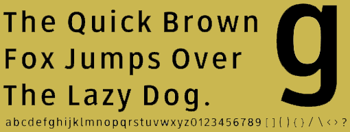
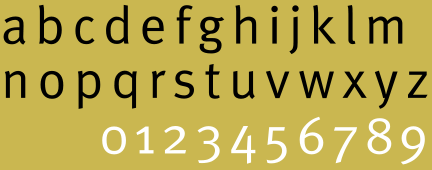
Mijksenaar: For most signage systems we use Frutiger, but since there are many contemporary, highly readable new type fonts, we are not that strict if there is a reason to vary. So, we use Meta and Thesis additionally.
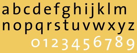
(Clearview was developed specifically for the traffic signs of the U.S. highway system.)
