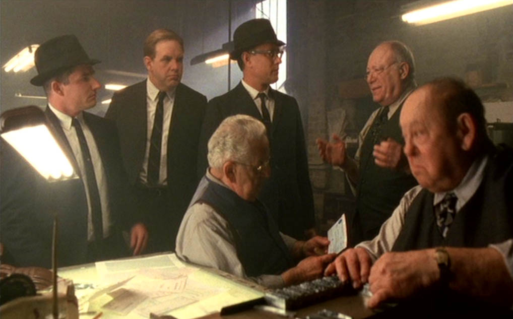
Scene 18 — 1:47:07
As Hanratty visits a print shop to show them the checks printed by Abagnale in Europe, crucial information is given on check printing to the point where we need to analyze the printers’ comments sentence by sentence.

Scene 18 — 1:47:07
Here’s the quote before we discuss the details: “It’s a perfect one-sixteenth all the way around. Color separation is flawless — there’s no bleeding. [...] It was printed on a monster — a Heidelberg — maybe an Istra — a dinosaur, four color. You can smell the weight — two tons without the ink.”
(The printers suggest that such printing quality is only obtained in Germany, Great Britain or France. Abagnale gets arrested in France.)
Bear with me and I’ll show you it took a feat of engineering to produce good looking checks as Abagnale did in his time!
Color separation is flawless. [...] four color [...]
With the current printing techniques, each color separation is output to a photographic film used to create the printing plates. Generally, full color documents — document with many colors as in a photograph — are separated into four basic process colors: cyan (C), magenta (M), yellow (Y) and black (K). This kind of color separation is called “CMYK separation”.

If you know a bit about color theory, you must be wondering by now why black is needed at all. After all, aren’t the three additive colors — red, green and blue — sufficient to merge into any color?
OK, that’s additive colors — think of a painter mixing colors on his palette on or on the canvas… When you’re separating colors, you’re dealing with subtractive colors — colors that absorb any light that falls on the printed matter. So, we need to replace the three additive colors by their subtractive counterparts cyan, magenta and yellow. So, in theory, printing equal parts of cyan, magenta, and yellow on paper should subtract all light reflected from the paper and thus create black…
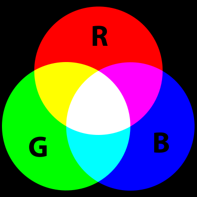
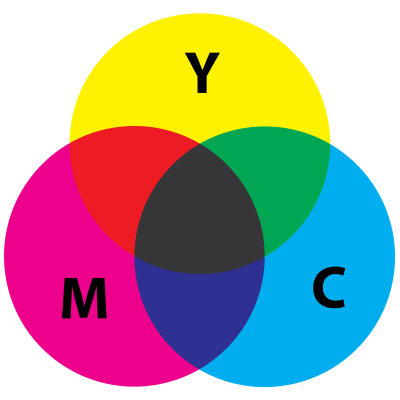
But in the physical world, any printing ink holds impurities and mixing the three subtractive colors gives you a murky, muddy brown at best. To overcome this deficiency in the color separation process, printers remove some cyan, magenta, and yellow in black areas (areas where the three colors exist in equal amounts), and replace it by the fourth color by printing black ink instead. This is the four-color process that dominates the world of printing…!
The four separation plates are printed consecutively with their corresponding ink color. Each pass through the rollers adds a new color of ink to produce the final full-color image.

These inks are semi-transparent, translucent. In areas where sequential printing is done with several colors, the combined color is perceived. For example, print yellow on top of cyan and you get green…
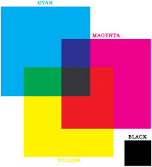
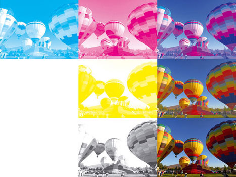
Nowadays, color separation is very easy, because it’s done by software. But in the old days, it took the craftsmanship and experience of a skilled printer. And we need to consider how tough checks (and paper money) can be in this respect! We’ll come to it…
Here’s the highly technical explanation you’d get from a printer: it’s the screen dot pattern created when the four color halftones are placed in the traditional angles. Two or more halftone screens are printed over one another with a 30° or bigger angle difference between them. (You have to vary the screen angles to avoid the different colors getting superimposed.) For example, a 45°, a 75° and a 105° combination yields a good 3-color rosette — these tiny patches are called “rosettes” too, sorry — without an objectionable pattern.
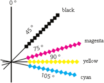
OK, this definition raises further questions: we need to explain what halftoning is, but bear with me because you’ll learn how printing really works… Halftoning is the printing technique that makes use of single-color dots of varying size, shape and spacing to simulate continuous color. Tiny discrete dots of one color become mixed “rosettes” on the paper, your eyes see just one color.
In a black-and-white image, the halftone dots are printed entirely in black (K). In color images, there are four screens (CMYK).
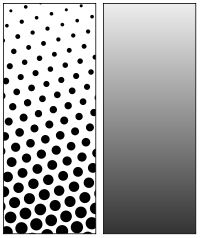
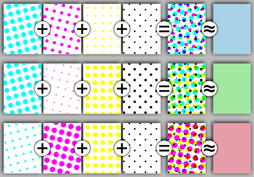
If you were to look at colored text or a photograph on printed matter — a book, magazine, newspaper, postcard, calendar etc. — with a strong enough magnifying glass, this is what you’d see! Where the human eye sees continuous color, say a certain blue, green or red, the magnifying glass would show you patterns, so-called “screens”, composed of dots of different sizes and shapes, but where each screen is just one color — either cyan, magenta, yellow or black.
Let’s turn to art to explain the optical illusion. The impressionists, and even more so the pointillists among them, did the same thing on the canvas. Move in too close to an impressionist painting and you just see patches of paint. You could be fooled into thinking you’re looking at an abstract painting. But move back to the correct distance and you’re watching, say, a sunday picnic by the river, a flower arrangement etc. Move in on a pointillist painting and you’re watching not patches of paint but actual dots!
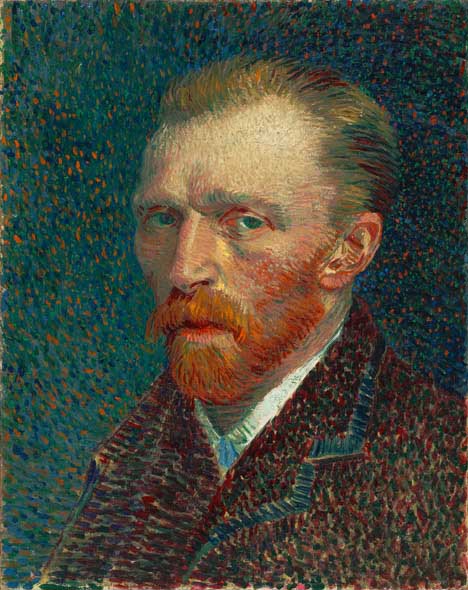
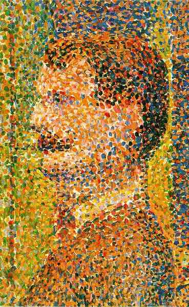
(None of this is a coincidence: the color theory was developed in the 19th century. The impressionists were aware of it, the pointillists studied the science in great detail. Placing various colors closely next to each other allowed the eye of the viewer to create the impression, that was precisely the effect they were after! Moreover, the impressionists avoided the use of outlines and used short but thick brush strokes. Paint was applied heavily but not allowed to dry: fresh paint would be added with the previous paint still wet, so that the colors mixed naturally on the canvas! Is it any surprise that the impressionists unleashed color?)
With color printing, you get the same thing: the dots are just much smaller, and your eyes blends them under all circumstances, however close or far you hold the paper!
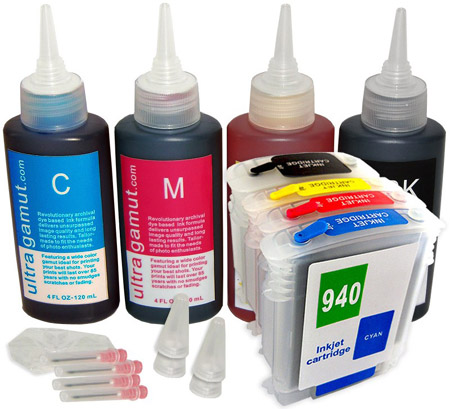
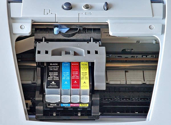
Now back to printing: the small inkjet printer you have at home creates small dots too! (The “jet” bit in the term indicates that the printer head shoots small droplets of ink into the paper.) With all you know about printing now, are you surprised that it takes (at least) 4 cartridges with the colors CMYK to produce color documents?
And — how can we avoid mentioning it on this web site? — a similar optical illusion allows to create moving images. A movie is composed of (at least) 24 still, “discrete” film frames per second that fuse into the illusion of continuous movement because your eyes and brain process the images that way. Slow the speed down to, say, 15 frames per second, and the motion becomes jittery, as if you’re watching an early, flickering silent movie. (Their frame rate could be as low as 14.) There’s a neurological reason for this: your visual cortex holds onto an image for about one-fifteenth of a second. The illusion of fluid, continuous movement starts when you’re presented with about than 18 frames per second...)
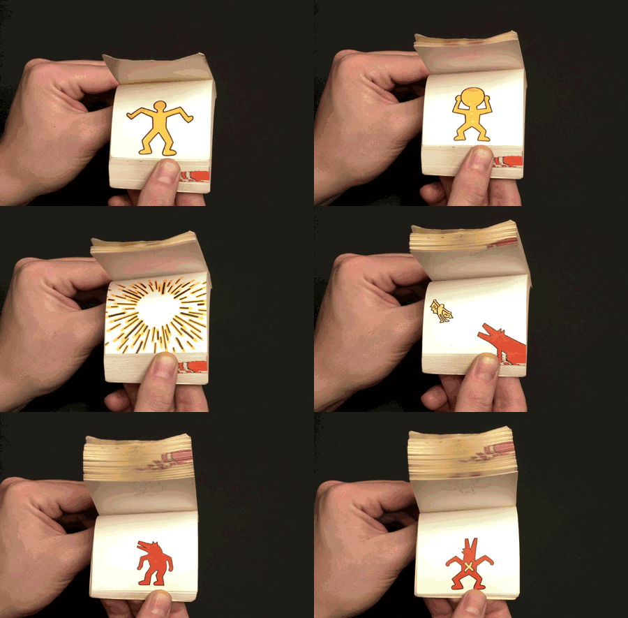
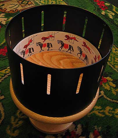
OK, I guess you knew that. You’ve all played with a children’s flip book or you saw a zoetrope in a museum — a revolving drum with static pictures on the inside seen through the narrow vertical slits on the side of the drum.
Or maybe you’re familiar with the photography of Eadweard Muybridge, who triggered photo cameras sequentially to study the movement of horses, people etc.


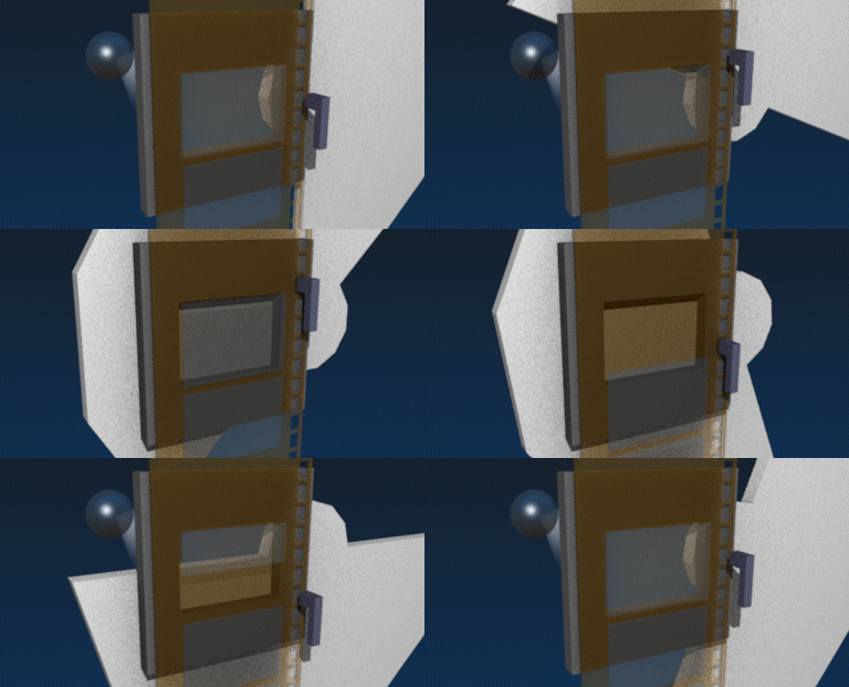
But what only few people know is that when you were watching a movie in an analogue theatre (not the digital ones you visit today), your eyes were often exposed to 48 or even 72 images per second. The inner mechanism of many movie projectors was designed to project each image twice, sometimes even three times before you moved on to the next frame! (When you’re subjected to 48 images, the frames are shown for only 20 milliseconds.)
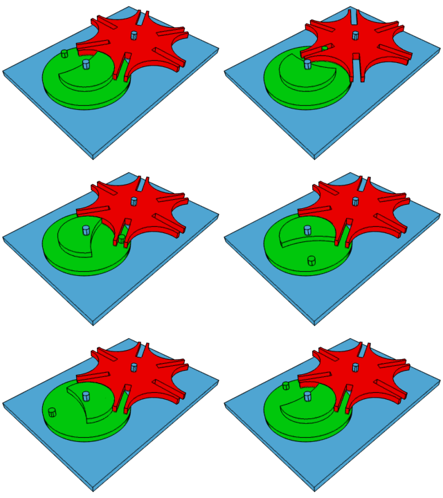
The mechanical shutter, often in the shape of a Maltese cross (a.k.a. a “Geneva drive”), opened and closed, thus determining when a frame got illuminated, projected on the movie screen. But it also pulled the film roll frame by frame violenty through the camera! That’s why you used to have these perforations or “sprocket holes” that still make everybody think of movies on both sides of the film stock…! (The violence of this process explains why analogue, chemical film wore down easily and why film often broke in the early days.)
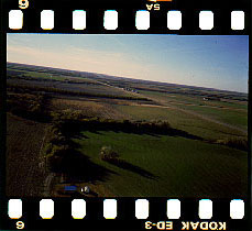
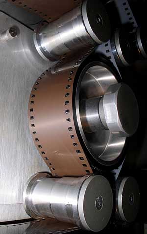
Movie projection simply depended on this intermittent mechanism: if the frames were just dragged past the projection lamp, the movie would have become one long, unwatchable blur.
(I‘m now skipping the discussion on
Peter Jackson’s
movie
“The Hobbit”
(2012), the first movie filmed at 48
fps!)
IMDB page on The Hobbit
—
Wikipedia page on The Hobbit
(All of that is movie projection. The refresh rates on TVs and computer screens are different! On your computer, increasing the refresh rate reduces flickering and hence eye strain.)
We PC on computer screen technology
Back to checks and the world of security printing! So, what makes printing checks (and paper money) so difficult? You’ll for instance get rosettes printed on them.
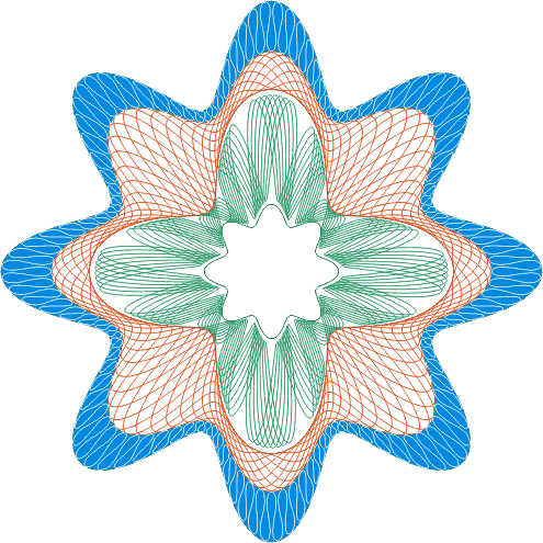
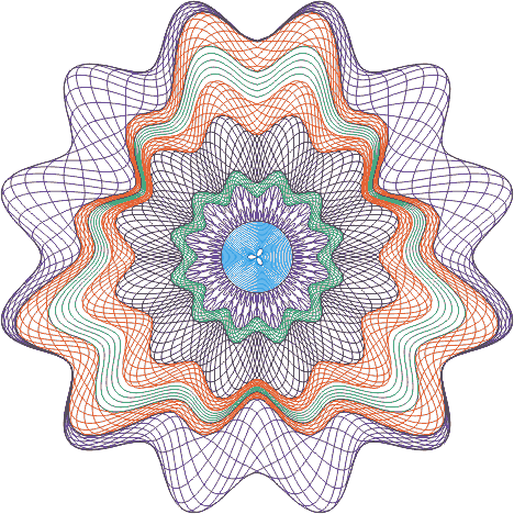
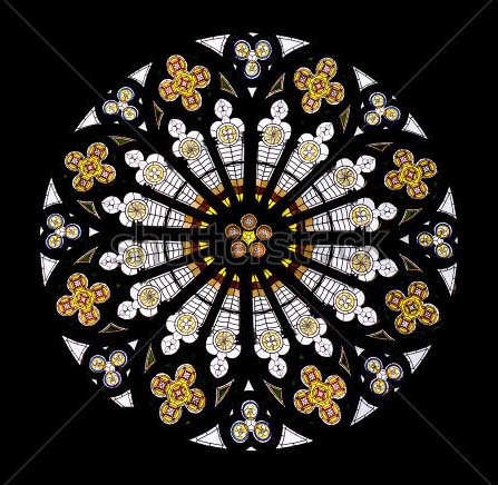
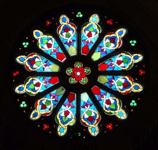
To understand what a rosette is, simply think of the circular arrangements in stained glass windows. (The same term is used in botany to describe such arrangements of plant leaves with an equal length, in medicine when a cluster of cells forms around a central blood cell in a flower-like shape etc.)
Or here’s the technical definition of Taylor Communications, a company for secure documents that Abagnale often consults for: “Complex line art with fine high-resolution lines developed into continuous curved patterns. Rosettes offer an elegant and complex appearance to the document that is difficult to copy or counterfeit, and can include additional covert security features like circular microprinting.”
You can also speak of a “guilloche” or a “guilloché”, that’s another technical term for this kind of intricate, fine-line pattern. With rosettes, the repetitive ornament has to be circular, but guillochés don’t have to be.
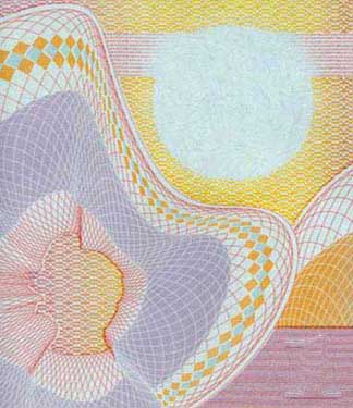
Now that we’ve explored how printing works, we can see why rosettes and guilloches — complex arrangmements of intersecting lines in varying colors — were (and to a lesser extent are) difficult to print: it takes precise color separation with — in the 60s at least — primitive printing techniques. And to print any document properly, let alone rosettes, you need to get the angle of the halftone screens right! See the difficult task that a check forger or money counterfeiter is faced with? (Technology breeds crime — always has, always will — but it also breeds measures one can use to counter fraud…)

But that’s not all. There’s also the printing and scanning phenomenon called “moiré” patterns. Sit back for some more theory!
To get a well printed document, the angle of the halftone screens plays a crucial role. Wen a halftone screen with an angle less than a 30° angle gets included, an ugly pattern develops: the halftone screen patterns become visible!
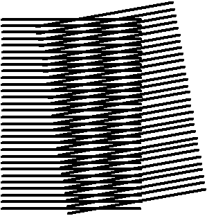
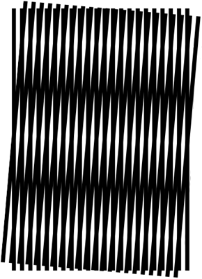

It all depends on the angle under which the lines or haltone screens printed on the paper intersect with each other… The animated picture illustrates that beautifully!
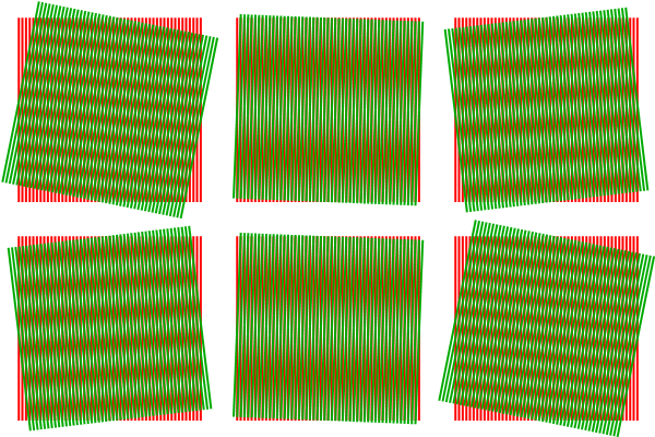
(That means moiré patterns can usually be avoided by changing the screen angles or by using stochastic screening. The word “stochastic” means “based on a random variable”: stochastic screening uses randomly placed dots instead of the traditional halftone dots aligned along the nice, neat (and visible) screen angles. Randomly placed dots won’t cause moiré patterns. Then again, completely random positioning doesn’t work well: it can cause graininess and other visual artifacts.)
So, it’s difficult to print vectorial drawings with fine crossing lines. But the buck doesn’t stop there: moiré patterns can also be the result of scanning a document…
This we already know: any image printed with a printing press is printed with halftone screen patterns. Now, the fine, single-color dots of the halftoning screens cause optical challenges to the scanner because the scanned image is also composed of fine dots. The interference between the two creates the moiré pattern.
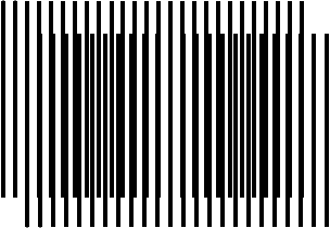
The two fine dot patterns — the halftoning pattern used to print the document and the pattern of the scanner’s samples combine into maxima or minima every several pixels in the image, depending on the spacing of the dots. It affects the overall light intensity in periodic patterns that become very visible. Moiré patterns!

When scanning images from printed material like magazines, you’ll often discover a murky herringbone, crosshatched or dotted pattern in your digitized images.
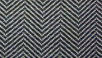
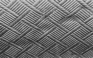
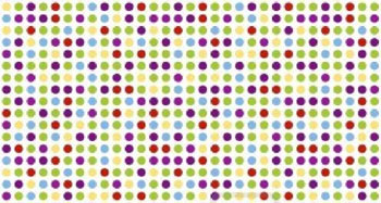
It all depends on the image resolution. Resolution determines the degree of detail in an image — think of an HDTV versus a normal one!
Here are some interesting facts you didn’t know. DVDs have a much lower resolution than you thought: they display 720 × 480 images with nevertheless 345,600 pixels on the screen (the “480p” format). The successor format Blu-ray (the “1080p” format), designed for HDTVs, encodes 1,920 x 1,080 frames, which corresponds to 2,073,600 pixels displayed on the screen… Yes, Blu-ray discs are more expensive but they also offer 6 times more image information!
One last comment: you may think
that sharper is always better, but
you’re wrong. From a certain
point onwards, too much detail can seem
unnatural! When the dinosaurs start
charging in
“Jurassic Park”
(1993), some
blurring
is added to make their motion look
realistic!
IMDB page on Jurassic Park
—
Wikipedia page on Jurassic Park
As soon as the scanning resolution is high enough, your scanner is bound to pick up the individual dots of the various halftone screens instead of the colors that these screens in combination produce for the human eye, a piece of hardware with a much lower resolution.
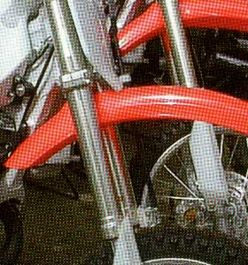
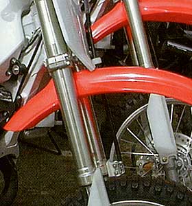
Take any photo in a glossy magazine. An insect sees the first image, the human eye picks up the second image and an image scanner digitizes the third image.
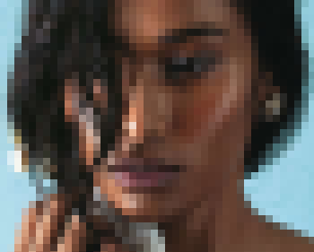

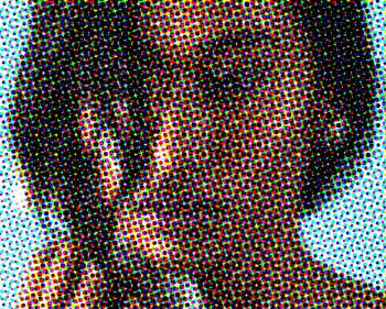
OK, these images are artificial, exaggerated, but they imitate the effect beautifully! Actually, a strong magnifying glass will show the halftone screens. (A good printer’s loupe magnifies at least 10 times.) Visit any printing shop and you’ll these things sitting on the desks…
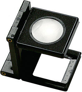
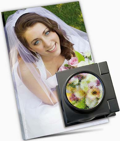
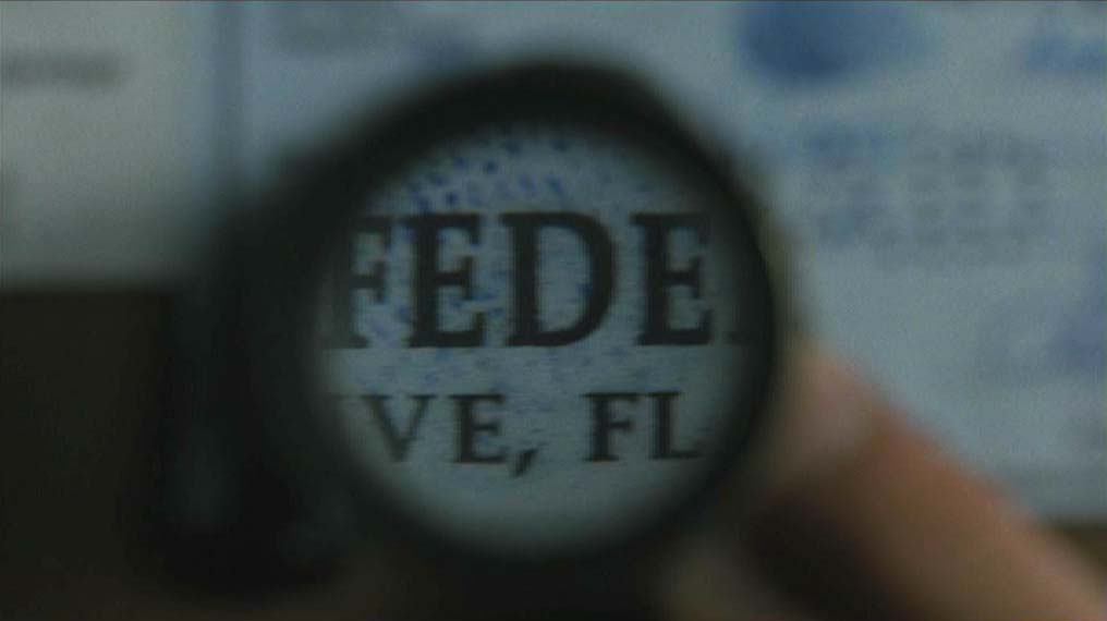
And in scene 21, you see Hanratty and Abagnale using exactly such a magnifying glass to study a forged check! (It’s not a real one — a real printer’s loupe magnifies much more — but that would confuse the movie-going public. You see it flying over the check for a few seconds and are supposed to think “magnifying glass!”. Showing the literal reality would leave the audience befuddled.)
Scene 21 — 2:08:12
And we don’t even need to zoom into the pixels to see wherin lies the problem: the scanner, offering much more detail than the human eye, pushes the yellow, magenta etc. dots of the halftone screens right in our faces! Printed on paper, the halftone screens are too small to be noticed by the human eye, but the machine does detect them and uses them to recreate the image digitally. And at this point, the patterns of colored pixels in the digital image have become too large for the human eye to ignore them any longer.
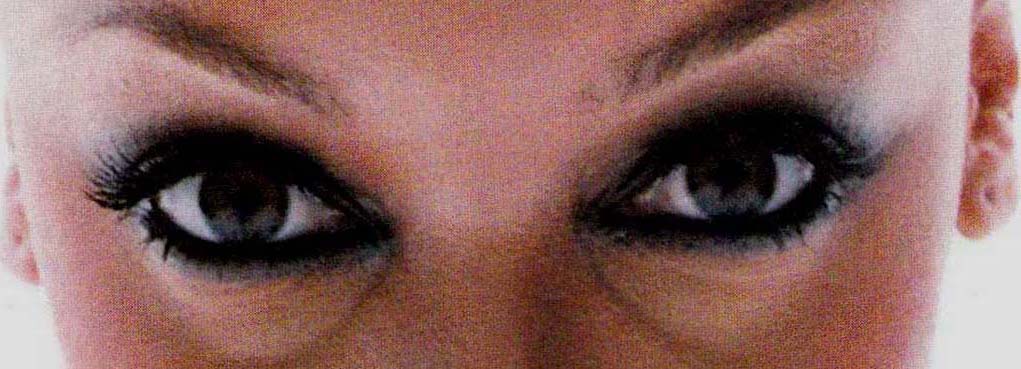
To cope with this problem, plenty of photo editing software comes with a “descreen” filter to remove the halftone screens from scanned images. Here’s a “before” and “after” picture! (More about scanning soon...)
Let’s investigate what happens when you specifically scan… a rosette!
First of all, as you scan a check (or a bank note), the fine lines gets lost… Vector graphics use mathematical expressions to represent geometric shapes — lines, polygons, curves, circles etc. —, bitmaps are composed of colored pixels. (Remember the impressionists and pointillists?)
The digital snapshots you take with your photo camera or cell phone are “bitmaps” or “raster images” (even if you see vectorial lines in them!), the logo that your company got designed by a graphic artist is a vectorial graphic!


Zoom in to discover the truth. Bitmaps depend on the image resolution, with vector graphics, the lines and curves stay perfect! Of course, you’re watching these logos on your screen, which means they’re converted into bitmaps anyway, but you get the meaning. (Trust me, I downloaded the vector graphic file of the Facebook logo and produced three bitmap images from that single file, doubling the size each time. I got a crisp result in all cases, and that’s the point I’m making here.)


With bitmaps, zooming in (several times) always suffices to display the individual pixels that compose the image’s grid…

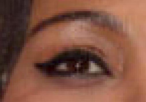
Scan (and reprint) a check or a bank note and the fine vector lines of the rosettes unavoidably become jagged — or even invisible if the scanning resolution is too low! It becomes immediately clear you’re dealing with counterfeit, which is why rosettes get used in the first place!

The smart reader will wonder why this phenomenon doesn’t occur when you’re for instance typing or reading text on a computer. After all, letters are small — too small to be painted smoothly on a computer screen! The answer is anti-aliasing. Anti-aliasing is the common name to describe any software technique that reduces “jaggies” on the screen by filling out the surrounding pixels with grey or color. This softens the harsh stair-like steps to the point where your eye and brain are fooled into thinking that the lines are actually smooth.



(Microsoft has developed its own implementation of subpixel anti-aliasing, it’s called ClearType. We won’t go into it, that would lead too far.)
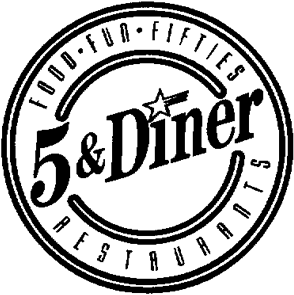
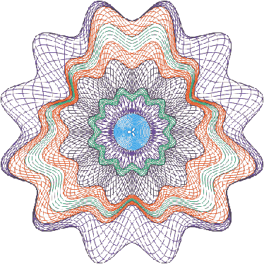
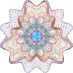
Back to checks. Would you accept a check or a $100 bill from somebody if it had the same “jaggies” as our “5 & Diner” logo or our scanned fish? Or if you asked you to recreate our rosette perfectly, not with a vector drawing package such as Adobe Illustrator or CorelDraw — which is cumbersome enough — but with an image scanner and photo editing software such as Photoshop, would you accept that mission?
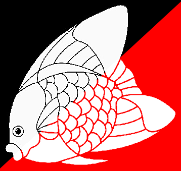
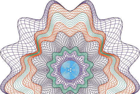
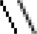
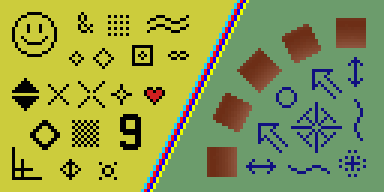
Now study the bitmaps below for a few seconds: horizontal and vertical vector lines “translate” into bitmaps better than diagonal lines, let alone the constantly curving lines of rosettes…!
Furthermore, raster images are resolution-dependent as we already indicated! Scan a document at various resolutions and the image quality can (and ultimately will) drop dramatically! I’ve taken our rosette and resampled the image twice, with 20% and 40% less pixels. See how quickly my rosette goes sideways? Initially, I have enough pixels in my grid to represent the curves smoothly, but dropping no more than a fifth of the pixels already suffices to break up some curved lines and to make others decidedly jagged. As for the image with 40% less pixels, well, see for yourselves…

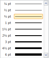
The thinnest lines you can draw (and print) with vector-based software — smaller than a mm. — are often called “hairlines”. (They’re not of the receding kind, mind you!)
The second reason why checks and bank notes are difficult to reproduce is that you’ll see vignettes printed on them. Vignettes are halftones with the background gradually fading and blending from one color to another.
You may have heard the word “vignette” before, so let’s be clear about our terminology. According to the dictionaries, a vignette can mean several things:
The first two definitions show the path! (When the design is based on a spiral, the word scrollwork is often used — think of the art movement called “art nouveau”.

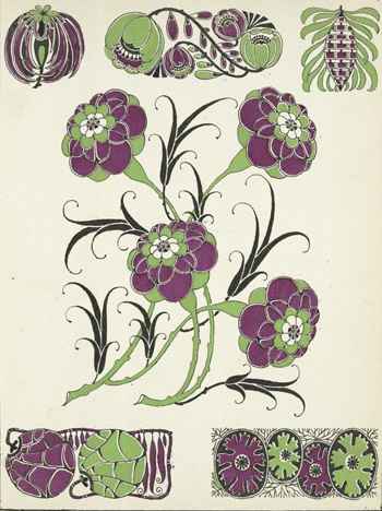
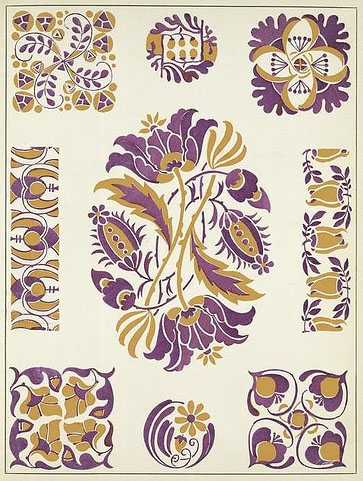
Prismatic printing is more complex than just vignettes. Here too, you get fading and blending of two (or more) colors in the background, but with added complexity: the different colors are produced by the same printing unit! The inks merge where they meet in the ink fountain — no color separation here! — to form a blend of colors in the background. A “rainbow effect” is produced!


Let’s have a look at a check Abagnale designed, the SuperCheck! Watch the ornament on all borders of the check. And see how the complex vector patterns in the background — not circular and hence not “rosettes” but certainly “guillochés”! — fade from blue to brown and back to blue…
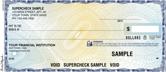
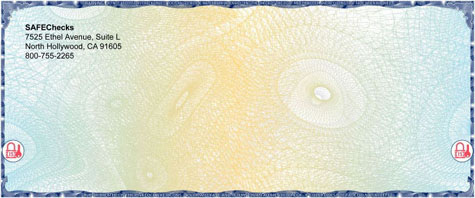
Why are rosettes, vignettes and prismatic printing used on checks and paper money? The reasons don’t change: they’re very difficult to reproduce, and when scanned or xerox copied, detail gets lost and the patterns tend to generate moiré patterns.
Detail gets lost? Let’s explore that a bit better, the $50 bill with general and president Ulysses S. Grant on it will help us…
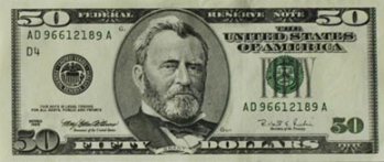


On a genuine $50 bill, the portrait of U.S. Grant appears lifelike and stands out distinctly from the background. On the counterfeit bill, the portrait is lifeless and flat — very different from the moderate “3D” effect of intaglio printing. Details merge into the background which can be too dark or mottled. (And that’s why an engraving gets used for the portrait!)
And now the vignette on all borders of the bill — hope you recognized it as that! With a genuine bill, the fine lines in the border are clear, unbroken. On the counterfeit bill, the lines in the vignette have become blurred, indistinct.
Which brings us to the closely related phenomenon of “high-resolution borders”. Those are white-line patterns against a solid or screened dark background to showcase the authenticity of a document.
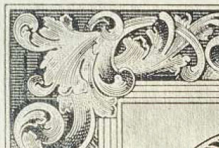
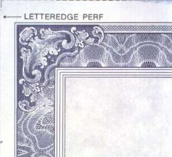
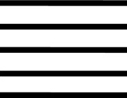
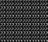
This time, we’re not talking about the vignettes but about the line pattern in the background. Straight lines (of two widths) in our first example. In the second example, more white lines on the inner border but also a fine “chainmail-style” pattern on the outer border.
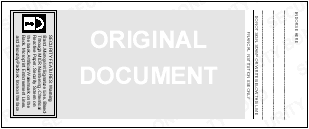
A similar phenomenon occurs on the back on many checks: a “security screen”! It’s a lightly printed screen with reverse text, for instance “Original document”, that isn’t duplicated by scanners and copiers. Only a quality check printer reproduces it with fidelity! Copy or scan the back of such a check and the words fade, distort or simply disappear.
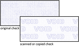
The opposite is also used: with copy voiding, extra information shows up when you copy or scan a check but is invisible in the original check. Yes, void pantographs are a hidden but highly efficient security feature!
A background design is incorporated in the document that you can’t detect under normal circumstances. But scan or xerox copy that same check and the hidden message — the words “VOID”, “NULL”, “UNAUTHORIZED COPY” or some similar phrase — appears in the image…
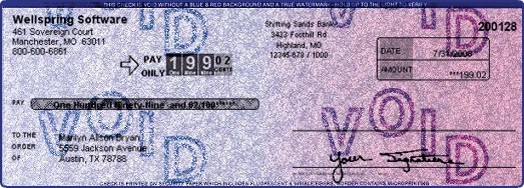
You’re probably thinking of spy stuff such as invisible ink, but it’s just sophisticated printing. A light-colored pattern that’s hard to reproduce gets printed on the document: the halftone screens of the printing process are manipulated to produce a dot pattern that the human eye can’t see but that a wide range of scanners and copiers will detect! (Admittedly, it does take highly specialized software to generate the correct halftone screens.)
(“Pantograph” is actually a Greek word, but don’t ask me to explain its many, difficult meanings. In this context, the word is used as a metaphor and studying what it really means would actually make it more difficult for you to understand what’s meant here...)
Of course, having a hidden message show up in scanned images of checks creates a problem for the dematerialized “substitute checks” of the “Check 21” legislation! Then again, some fancy technology is available to keep the check images clean when the checks are scanned by a check sorter, but not when a regular image scanner or xerox copier gets used. (Hint: the halftone screens of the void pantograph depend highly on the scanning resolution. And no forger scans a check at the image resolution of a check reader, that low-res image is worthless when you want to print a good-looking check with any realism...)
For the sake of completeness, I’ll quickly mention one more if minor feature of secure document printing — not that you can see it illustrated in the movie: laid lines.
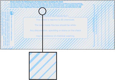
Laid lines are lines of varying width and spacing that make it more difficult for forgers to cut and paste information from one region to another. And that’s really all they are…
On the next comment of the printers in the movie: “There’s no bleeding.”
Bleed is the extra extent of a printed image (usually 3 to 5 mm.) beyond the trim edge of a sheet or page. The extra area on the drawing or printing plate that extends the plate beyond the trimmed or folded size ensures a clean cut-off: after a page has been printed and trimmed, the image will still continue to the edge. The extra bleed area absorbs the normal and expected variation in production.
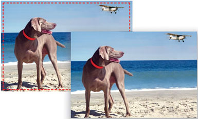

Without bleed, a brochure with a, say, blue background, would have ugly white borders. Maybe not on all copies or all pages, but certainly on some pages and some of the 4 borders!
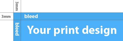

A “full bleed” means that the image extends on all four sides of the pages. It requires the use of a oversized sheet of paper. For instance, an 11x17” full-bleed page actually gets on 12x18” (or larger) paper before it is trimmed.
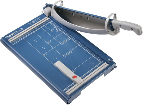
The machine you need to finish printing with bleeds is called a “paper cutter” or “paper trimmer”. The one you see here on the left is an entry-level machine of the “guillotine” type. The bigger machine on the right indicates that there’s a whole range of cutters-trimmers depending on the volumes to be cut and the size of the printed matter — from specialized machines to cut small business cards over cutting tables that trim posters to rotary machines to cut newspapers as part of the printing process.
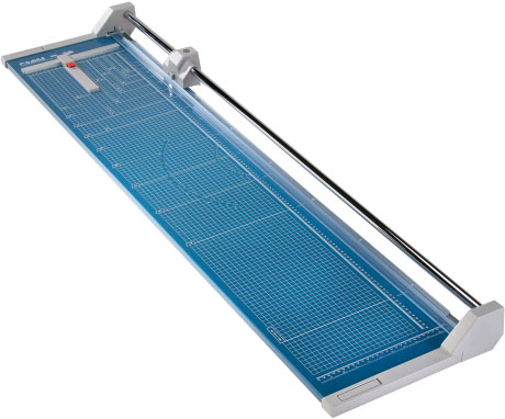
So, that’s how you get printed documents with color right up to the paper borders! (“Crop marks” indicate where the page is to be trimmed, more about them soon...)
One more thing: with flexography — a printing process which uses a rubber or plastic plate instead of a stable metal one as offset printing does —, the borders on the sides are never very clean. Flexographic printing is used on (food) packaging made of plastic, foil, brown paper etc. So next time you’re about to throw a milk box away, have a quick look at how the borders are printed first…!
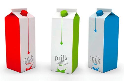
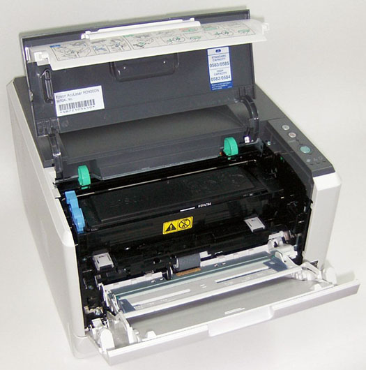
This you will know: laser printers and inkjet printers can’t print bleeds. They have a non-printing border, the printable area always excludes the last 5 mm. of a page! That’s because the print engine cannot physically print all the way to the edge of the paper: the “dead space” on the outer border is typically used for the mechanical handling of the paper. Open a laser printer and compare the size of the paper with the size of the printer engine if you never have!
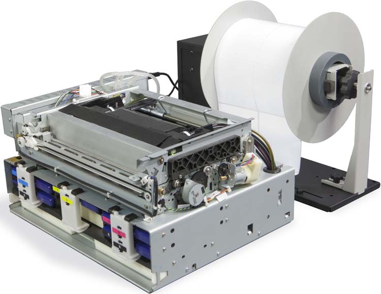
Here’s a printer whose enclosure was removed to show the printer engine. In this case, the label printer does print on the edges of the labels because the printer engine is visibly wider than two labels side by side. Which of course your laser or inkjet printer never is…
So, that’s what “bleeds” in printing are! But I don’t think this type of bleed is meant in the movie.
Let me explain: the printers find Abagnale’s checks flawless, amongst others because “there’s no bleeding”. When you print checks with a colored background, the opposite is true. You need bleeding if the background color is to cover the whole check. Without the extra space, even a minor shift of the paper in the printing press will lead to checks with ugly white borders — not neat, professional printing!
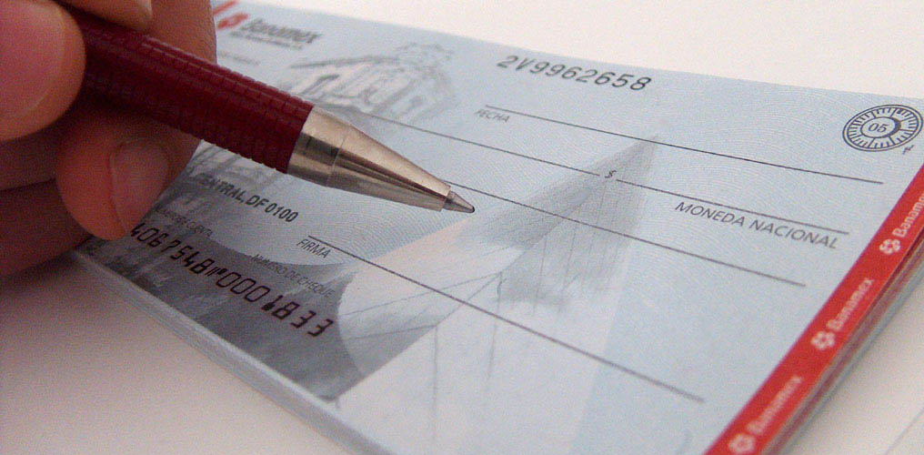
As for the many checks that don’t print up to the edge of the paper, a white border — indeed a risk when you print for instance a full-page photo without overflowing printed space for the subsequent trimming — isn’t an issue.
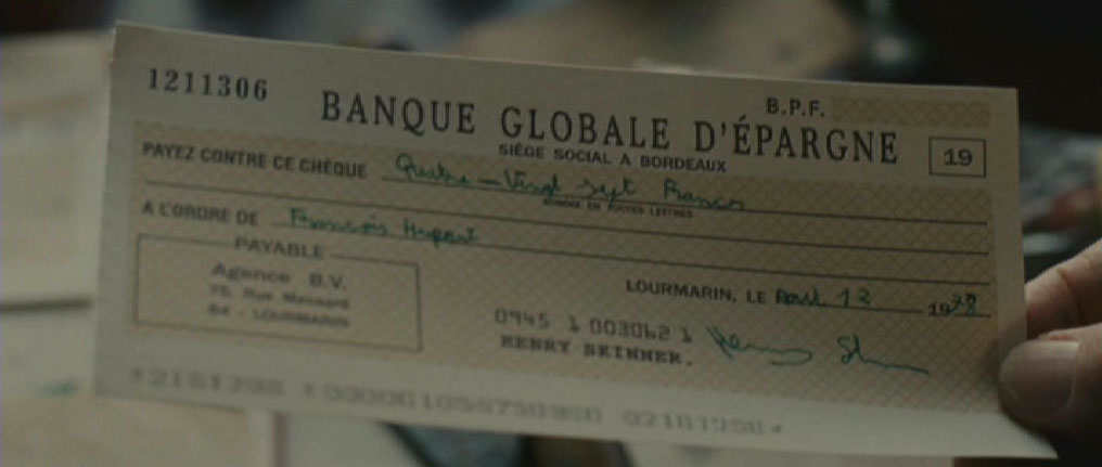
In my opinion, the “bleeding” of ink on the paper is being referred to. When the printer says “no bleeding”, I think he means “no color bleeding”.
Color bleeding is the mixing of different colors in neighboring printed dots before they dry and get absorbed by the paper. Some minor color bleeding is inevitable but unnoticeable; too much bleeding reduces the print quality substantially. The amount of bleeding depends on the paper type — how grainy is it and how does it absorb the ink? —, the characteristics of the ink — think fluidity, thickness and drying speed — and the spacing of the printed dots.
As a result, a straight blue line that should be sharp becomes jagged. And with the rough fibres of newspaper stock, bleeding simply can’t be avoided…

So, color bleeding deals with the way in which one color snuggles up to another in printing. Do the various colors fit like pieces of a puzzle? Or do they overlap, bleed into each other?
Which brings us to “misregistrations”. Now, this requires more explanation on printing processes.
“Registering” means aligning the different films and printing plates — the results of color separation, remember? — to produce one printed image.
“Registration marks” or “crop marks” are small crosshairs on film used in alignment. These marks are placed on the artwork to assist the planners and machine minders to print the image in the correct position.
Strictly speaking, you should distinguish the registration marks (crosshairs), designed for correct registration, from the crop marks (separate lines), designed to indicate the page border for the trimming of pages with bleed. But that’s just theory: they’re both in a fixed place on the film (used for the offset printing press) or printing proof and there’s no aligning the registration marks without getting the crop marks right and vice versa…
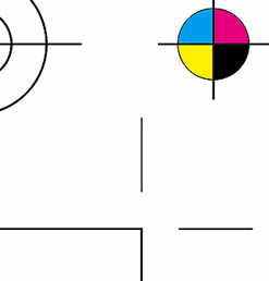
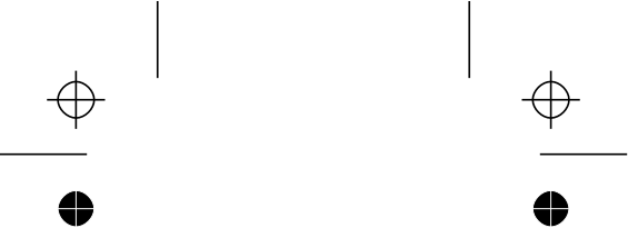
(Also notice the color bar and the small rosettes on our printing proof!)
If the colors are not aligned properly on a page (or if the paper stretches too easily), unintentional space — the “background” color of the paper — appears between the adjoining colors. This phenomenon is called “misregistration” and it is to some extent unavoidable. How can anybody ensure that the paper that moves through the large beast called a printing press to print one color after the other in the exact same way? Printing is an intensely mechanical process and some variation is bound to occur.
(Admittedly, misregistrations can have a number of other reasons — the film or printing plate has stretched, bad copying of film to the printing plate, a human error as the printing plates got mounted on the press etc. — but with a professional print shop, these bad errors shouldn’t happen.)
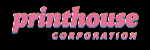
As is the case with moiré patterns, we only speak of “misregistration” when this phenomenon produces bad results visible with the naked eye. Here’s an example where the printed colors are badly aligned. (Understand that this was not done for effect here, it has nothing to do with, say, the Word or PowerPoint feature that adds a shadow to the font in big titles, logos etc.) Or perhaps a simple geographical shape with an ugly white gap shows best what goes wrong when the paper shifts too much between one color and the next…

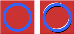
You see this kind of thing occassionally when a page in a magazine or newspaper was badly printed. (Ponder for a second what this printing defect would do to a rosette with plenty of color. Rosettes are nothing else than constantly crossing lines in varying colors… How ugly and fake does a misaligned rosette on a forged check look?)
But if it’s unavoidable, why don’t we see it a lot more? Or in just about every printed brochure or magazine we lay our hands on? We don’t because printers have two closely related solutions to cope with this challenge — trapping and overprinting.
Overprinting is doubleprinting, printing over areas already printed. For instance, by printing black outlines around objects, the risk of white space and a border of another color where the two colors meet border is gone. The cubes look better without the misregistration, don’t they?

This strategy of adding (preferably black) borders obviously has its limits. To compensate for misregistration you can also overlap colors a little. Overlapping colors are called trapping.
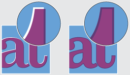
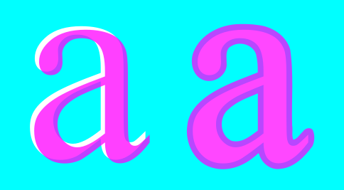
The situaton where no trapping or overlap is used is aptly called “knockout”. (The “knockout” is the portion of an image that’s been removed. When two or more colors are printed, they don’t print on top of each other. The bottom color is not printed, it’s “knocked out”.) So, the two shapes fit perfectly, but that also means they have to be printed perfectly to avoid unsightly white spaces and overly thick borders!
This illustration shows how trapping works. Apply the color separation to some magenta letters on a blue background and you get two color plates — cyan (C) and magenta (M). (Yellow (Y) and black (K) are missing from this image and who needs a color plate for absent colors? (If you were to make a plate anyway, it would simply be empty!)
The cyan plate contains two holes — the “knockout” — where the magenta plate has the letters “DI”. When the color plates start printing on paper, any misregistration produces small gaps between the two colors (where the white paper shows through) and a thick border on the other side (where the darker color prints over the lighter one).

To avoid the ugly result, you can increase the size of the letters in the cyan (C) plate slightly and maintain the original size of the holes in the magenta (M) plate. The colors now overlap, filling any gaps between the two colors.
There are two basic methods of color trapping: spread and choke. Spread is created by increasing the size of the overlying object. Choke choses to underlap color: the background hole is reduced while the overlying object maintains its same size. (Occasionally, both methods are combined; you call this “centerline” trapping!)
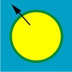
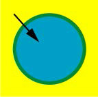
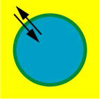
Generally speaking, one of the two trapping methods is used, depending on the colors of the overlapping objects. As a rule of thumb, the lighter object is increased in size. If a darker object is on top, choke is used. If the background is darker, one uses spread.
Always increase the lighter object, not the darker one! Doing it the other way around changes the size of your objects visibly.

To complicate things further, the ink coverage plays a role in the overprinting involved. Ink coverage refers to the total percentage of inks. Of course, printing one translucent color on top of the other is what color printing is all about, but there’s a limit to the amount of ink (or even toner) that can be put on paper! Because of this technical limitation, the ink that gets laid down last may not attach properly to the previous layers. You’ll get muddy browns in neutral areas and the ink won’t dry properly. And you know what happens then: when the printing press drops the next page on top of the still wet one, the ink rubs off on it!
(Apply the same principles mutatis mutandis to the other letter pairs if you want to refresh your color separations and exercise your trappings...)

“Knockouts” of cyan (C)
printing plate (lighter color) and
magenta (M) printing plate (darker
color)
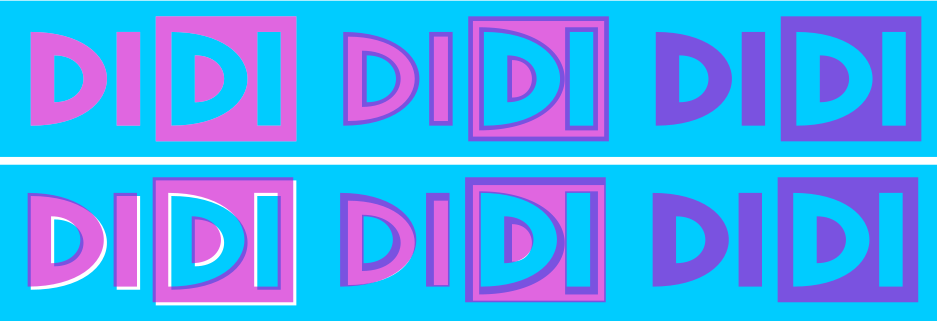
Good printing with trapping
vs. bad
printing without trapping
Back to rosettes: a rosette that uses four colors and isn’t aligned well is a definite give-away that you’re dealing with a fake document! Misregistration is therefore a big issue for check forgers and money counterfeiters.
And in my opinion that’s what’s meant here when the printer says there’s no bleeding in the checks. When you’re printing checks with rosettes, vignettes where one color fades into another etc., you not only need to separate the colors properly, you also have to mix them correctly on the paper once you start printing. By aligning the printing plates correctly, without misregistration. And by using the right paper and ink to avoid colors leaking into each other before they dry. And that, my friends, you can call printing “without bleeding”!
And this being a site about OCR, amongst other things, we can’t forget the special type of ink bleeding called “bleedthrough”! Think of a newspaper where you can see what’s printed on the other side — yes, the absorption of ink by newspaper stock can be that deep!
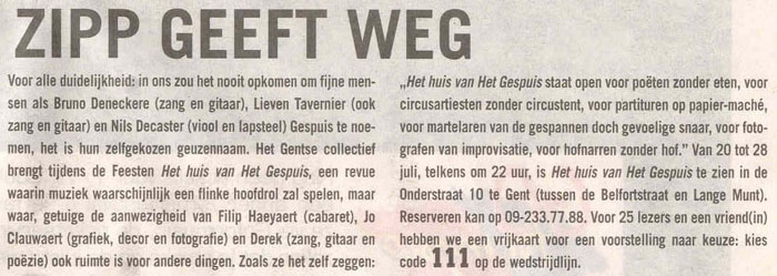
Not all types of paper absorb ink to the same degree, obviously. (Anybody that has put a diaper on a baby knows that it takes special paper to soak up liquid!) Nor is the viscosity of all inks the same…
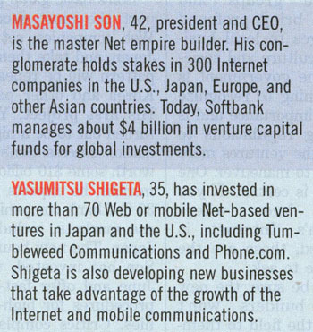
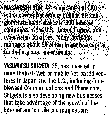
Bleedthrough can play a huge role when you start to scan documents. Recognizing documents with heavy bleedthrough requires a color or greyscale scan followed by binarization. A black-and-white image generates spurious pixels!


Binarization is a complex issue and we can’t go into the many aspects here. But may these images show some of the challenges… The objective is always the same: the background — whatever the colors are — has to be removed, turned into white pixels, and the text on the foreground — yes, whatever the colors may be — has to nicely stand out, get converted into black pixels.
And guess what? Bleedthrough may be an impediment to character recognition, but it’s also used as a document security feature!
Says Abagnale: “Bleedthrough can be used to prevent tampering with the serial number of the check: ‘A lot of times we number checks with a red ink or a black ink, and ink is removable. So I number checks with dye. It bleeds through the paper to the back of the check, and it stays on the check for the life of the check. This is known as ‘dual-image numbering’ (in Canada, it’s called ‘halo numbering’) because you can see the number on both sides of the check, and it makes alteration nearly impossible.” (book “The Art of the Steal”, page 49)
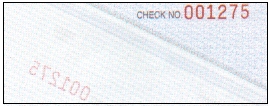
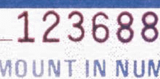
Dual-image numbers are control numbers that use ink containing two different components: black and red. The black component is printed on the front of the document and is surrounded by a red halo. The red component penetrates the paper fibers and is usually visible on the back of the check.
As the red ink soaks into the paper, it becomes very hard to remove the number. This makes tampering with or changing the control number virtually impossible. Furthermore, color xerox copiers can’t reproduce the effect, they just pick up whatever color is on the surface of the paper! (And reprinting such a check is no small feat either: the image scanner again doesn’t look beyond the surface and you still need to print the control number and nothing else with ink that soaks into the paper...)
In his white paper “Check Fraud and Identify Theft — Volume III” (2004) (page 7), Abagnale mentions that this red halo is sometimes applied to the entire codeline. Definitely a good idea, because that protects the check efficiently against alterations! For example, the scam called “the float” is rendered impossible because you need to alter the routing code on the codeline to pull it off!
Says the printer in the movie: “[The check] was printed on a monster — a Heidelberg — maybe an Istra — a dinosaur [...]. You can smell the weight — two tons without the ink.”
I wondered for many years what an Istra was. As I couldn’t find any information on that, I assumed it was a fictitious, invented name for a printing press model. I got a break when my attention was drawn to the “Imprimerie Strasbourgeoise” or “ISTRA”, a French printing company that started its operation in 1676 — no joke! — and closed down in 2010.
After World War I, this firm specialized in official documents for the government — the kind of document that may have contained some (admittedly crude) security features even then! And as the Heidelberg printing press wasn’t manufactured until 1923, this French player with a centuries-long history may well have developed its own technology over the years. (In 1926, their inventory included 300 tonnes of metal type!)
So, did they develop their own printing press that was never sold to other parties? It’s possible…
Even so, I’m pretty sure Abagnale never used any proprietary technology: he describes the machines he did use in great detail in his books. They do not contain the word “ISTRA”. But, as he lived in France for a while, he may have visited ISTRA in Strasbourg.
(Nathanson’s screenplay contains extra scenes that take place in France but they were were never shot. The movie is 141 minutes long and took 52 shooting days, three of which were spent in Montreal — supposedly the south of France — to shoot the prison scenes and the arrest in the printing company.
Even worse, the writing is shockingly clumsy; including this episode would have hurt the movie! Abagnale visits his mother’s family in Montrichard. They haven’t heard from Paula in 15 years but no explanation is given why that would be the case. The family owns vineyards — the usual cliché about France — but the wine is lousy and there’s no money in it. Their livelihood depends on — deus ex machina — a printing company with a Heidelberg. You can’t read these pages without cringing…)
The next question is of course how this obscure technology that nobody knows about made its way into the screenplay. The Californian screenwriter Jeff Nathanson can’t possibly have heard of it. The single realistic explanation is that secure document consultant Frank Abagnale suggested the name “Istra” for a printing press. The printers are brainstorming who could have produced pristine checks with which equipment and come up with several viable sources. Hence the Istra?
As for the Heidelberg, it was never in doubt. In France, Abagnale did build scaffolding on the side of a Heidelberg, just as you see in the movie. A Heidelberg printing press is 90 ft long, 18 ft high and requires three operators, but thanks to the custom extension, he was able to print fake checks without accomplices…
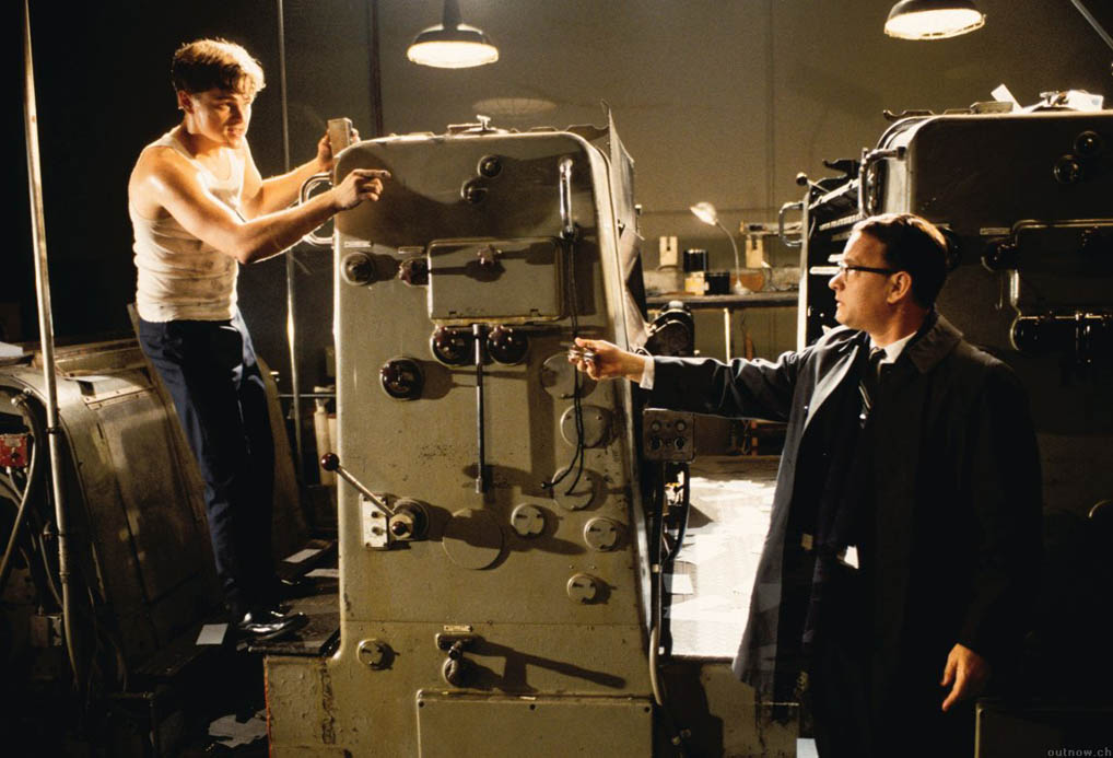
The Heidelberg is composed of 5 units. Say, doesn’t it take 4 colors — cyan, magenta, yellow and black (“CMYK”) — to print color material? Not necessarily. Extra colors can be used too!
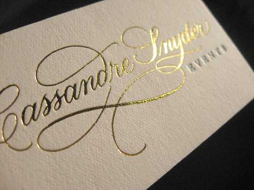
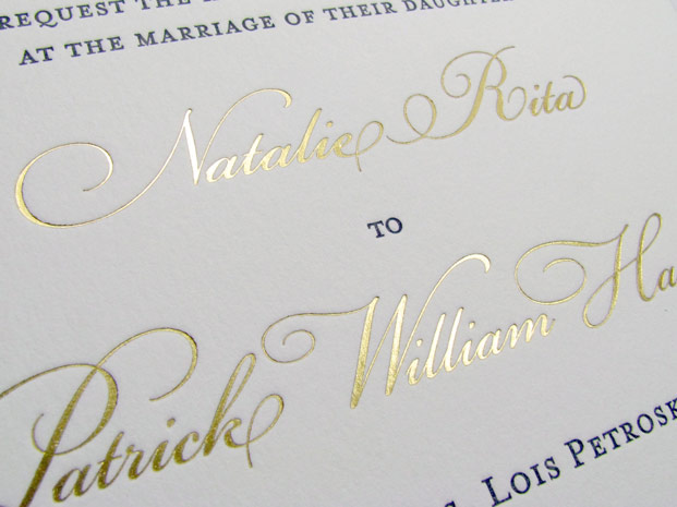
Hifi color printing is standard color printing with the addition of one or two colors as part of a color halftone to enhance the printing. Think for instance of gold or silver on a jewellery brochure. (In passing, this is embossed printing produced by a letterpress...)
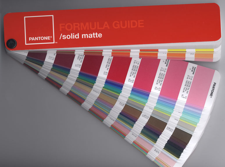
Hexachrome printing is six-color printing that uses enhanced cyan (C), magenta (M), yellow (Y) and black (K) inks with the addition of green and orange. This gives very vibrant results, you can in fact match 90% of the Pantone colors!
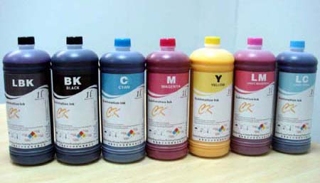
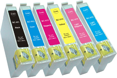
But I guess this is not a total surprise for you: after all, the inkjet printers have moved on too these last years. Notice the two extra inks — light magenta (LM) and light cyan (LC) — that allow print finer nuances and to extend the color range of your printer!
In real life, Abagnale never became a professional printer to forge checks. He did use an ITek camera and a small offset printing machine to create his own checks.
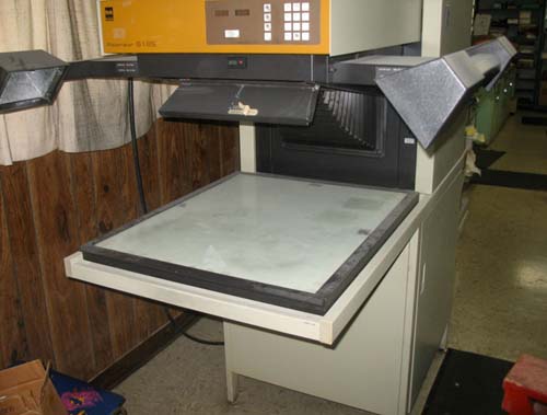
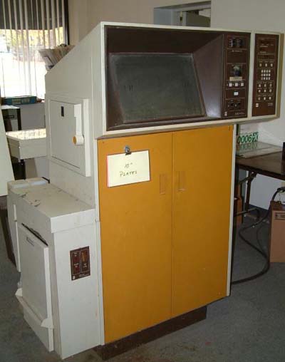
Oh, it depends on whether we’re making up plain checks or fancy ones; you know, the kind with pictures, landscapes and different colors. It’s a simple operation for just plain checks. I just lay it out on a big paste-up board however the customer wants it, and then we photograph it with an ITek camera, reducing it to size, and the camera produces an engraving. We just put the engraving on a little offset press and print up the check in blocks or sheets. Anybody could do it, really, with a little training. (book “Catch Me If You Can”, page 93)
And that photographic reduction, reader, shines light on the last unexplained comment from the professional printer: “[The check’s] a perfect one-sixteenth all the way around.” He’s praising the camera work that was done on the checks!
On page 118: “I invested in another ITek camera and printing press.”
Other than that, he met a girl that designed and printed checks in Las Vegas and hooked up with a French stewardess [Monique Lavalier, but the names in the book are fake!] whose father was a professional printer in Paris. He asked him to reproduce 10,000 “real” Pan Am pay checks: “The checks were beautiful. No, gorgeous. Real Pan Am checks, four to a page, twenty-five pages to the book, perforated and on I.B.M. card stock!” (pages 126-127)
Opening titles — Abagnale — Hanratty — Checks — Stationery — Pay checks — Pilot — MICR — Typewriter — Hotel — M.D. — Lawyer — Arrest — Prison — G-man — Sitemap — Search